10 logos of famous companies that hide secret meanings
Contemporary imagery is influenced every day by subliminal symbols and information, that is to say, by hidden meanings concealed among the various media images that are received on an unconscious level.
It is no coincidence, in fact, if many (if not all) of the most well-known companies have logos within which there are identifiable symbolic structures able to act on the psychology of the recipients or convey information about the company itself.
1. The yellow arrow on the Amazon logo

The logo of the digital marketing giant at first glance seems simple and devoid of secret meanings because the only components that are not letters are the dot and the yellow-colored arrow under the company name. Well, if you look more closely at the yellow arrow you can see how it looks like a smile, a symbol that has the purpose of conveying a sense of customer satisfaction. In addition, the yellow arrow connects the "a" and the "z", implying the exhaustiveness of the products and services offered by Amazon.
2. The bear on the Toblerone packaging
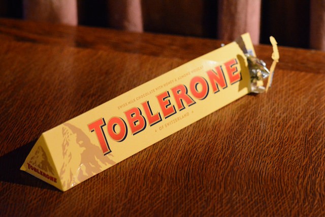
Have you ever tried to examine with a critical eye the Toblerone chocolate bar and its packaging? Besides noticing a certain resemblance between the shape of the chocolate bar pyramids and the Matterhorn on the packaging cover, you can also distinguish a bear drawn among the shadows of the mountain! In fact, the bear is actually, the symbol of the city where the company was born, namely, Bern, Switzerland.
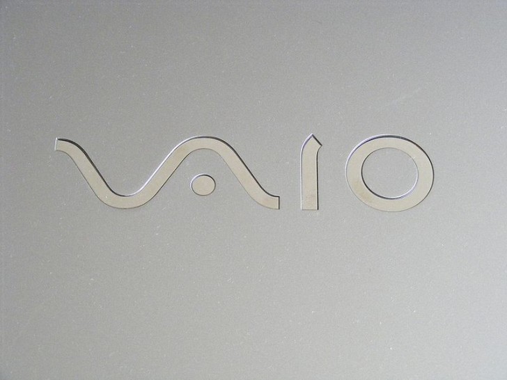
3. Vaio --- waves and the binary system
http://flickr.com/photos/orsorama/ Wikimedia
The Vaio logo, for the Vaio computer, which is a sub-brand of Sony used mainly for the construction of laptops, consists of a wave (on the left) and the numbers 1 and 0. The wave serves to indicate digital transmissions while the numbers refer to the binary system, both fundamental factors for computer operation.
4. The BMW emblem
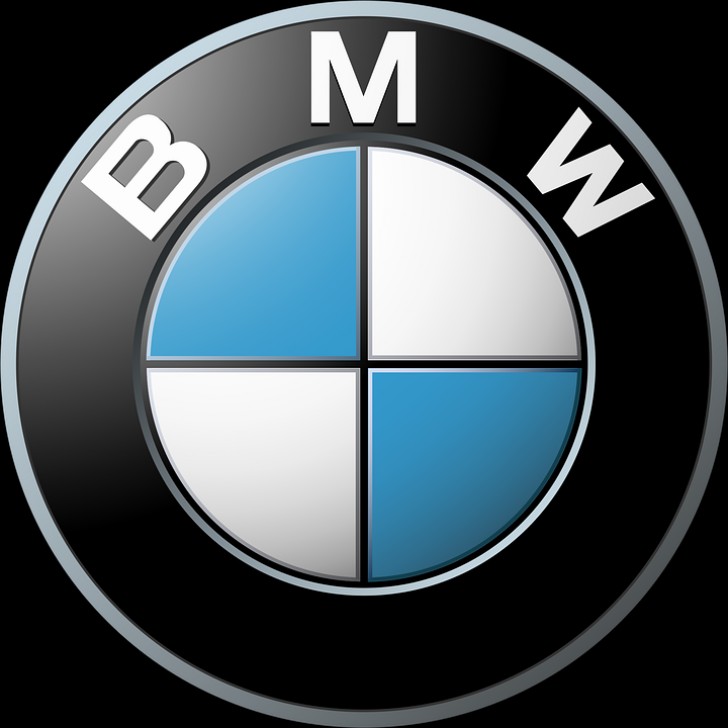
Many people have hypothesized that the blue and white BMW emblem recalls the propeller of the first airplanes, on the basis of the fact that the company was first dedicated to designing and producing airplanes. In reality, the logo, represents the white and blue flag of Bavaria, the region in Germany where the BMW company was born.
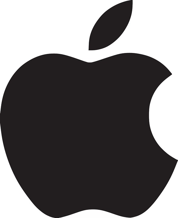
5. The Apple logo .... the apple itself
Clacker_Free_Vector_Images/ Pixabay
Designed by Rob Janoff, the famous Apple logo depicts an apple from a perspective in which it could be mistaken for a cherry. The famous bite on the apple, moreover, recalls the basic unit of information technology, the byte, while at the same time connecting it to the sound of the English word "bite".
6. Domino's Pizza dice logo
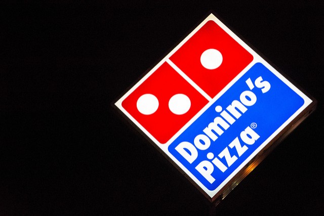
Domino's Pizza restaurant chain was founded in 1960 by Tom and James Monaghan, who bought a small pizzeria in Michigan to start their successful business. Shortly after, given the success of the restaurant, they bought two more and it was at that point that the current logo was created. The position of the dice actually indicates the geographical distribution and position of the first three restaurants opened by the company.
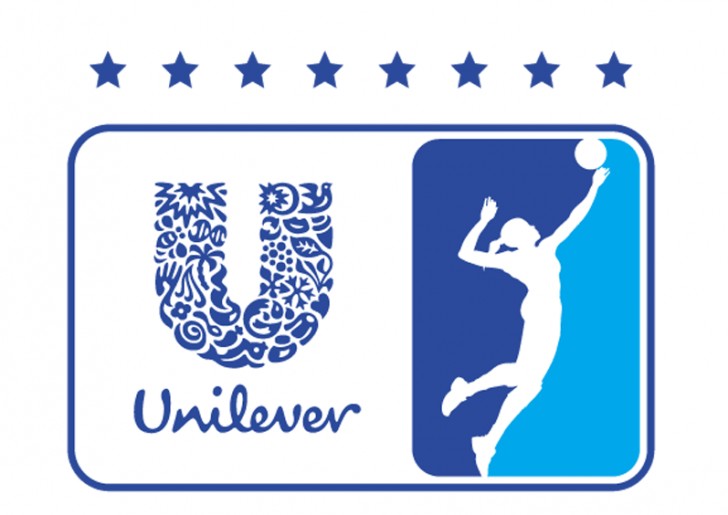
7. The "U" in the Unilever logo
Equipe unilever volei/ Wikimedia
You are wondering --- What is Unilever? Well, Unilever is a mammoth multinational company that incorporates more than four hundred brands in the field of food, hygiene, and products for the home. Among the incorporated brands, we find Algida, Lipton, Knorr and many others. Its logo is a "U" composed of 25 small symbols belonging to the 25 largest selling Unilever brands.
8. The Hyundai logo handshake
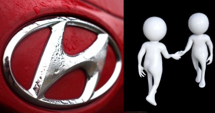
Looking at the Hyundai logo one could think of a very simple "H", the initial of the brand's name. The meaning of this symbol, however, is different. As a matter of fact, the "H" would be nothing but a stylization of the best-known gesture of cooperation, the handshake, conveyed on a subliminal level to induce a feeling of confidence in buyers.
Image: TheDigitalArtist / Pixabay
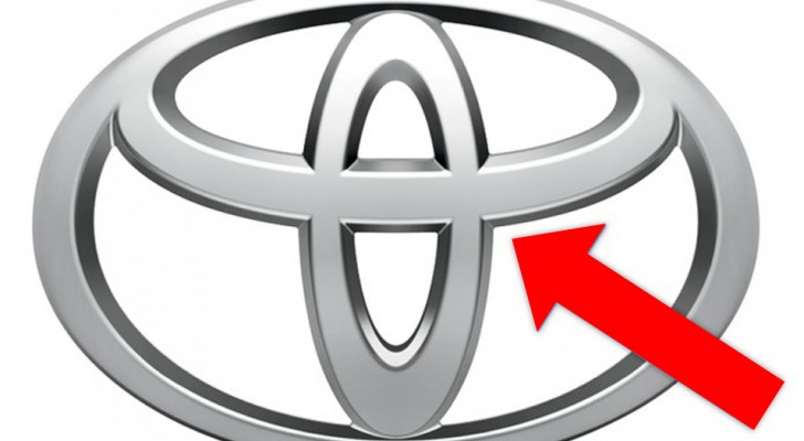
9. Toyota's needle and thread logo
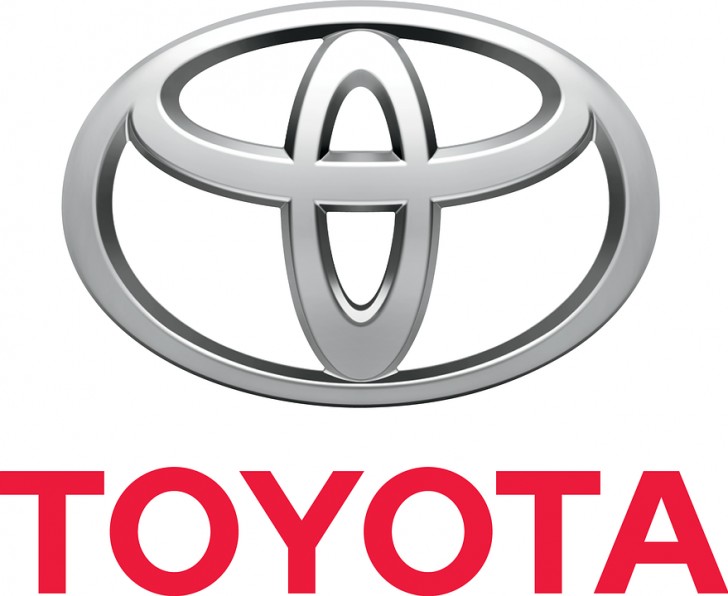
The Toyota logo can easily make one think of a bull or a cowboy wearing a hat - but nothing could be more wrong. The symbol is actually the union of the letters "T", "O", "Y" and "A" that make up the name of the company, and the image represented is that of a thread that passes through the "eye" (the hole on the upper end of a needle). Historically, before becoming a company that manufactured engines, Toyota was engaged in the production of textile frames.
10. The Continental wheel
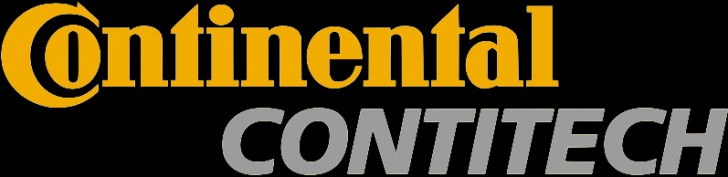
Continental was among the first companies involved in the manufacture of tires. Consistently with its products and with the success obtained in the automotive sector, the Continental logo can be individualized by isolating the first two stylized letters of the name which symbolize a car wheel.